Don't Assume It's the Logo
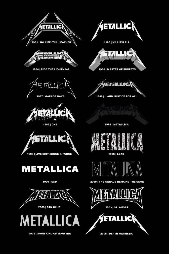
Metallica's logo has gone through more versions than most fans realize. Look at the album covers and you'll see real departures: a plain sans-serif wordmark for Load in 1996, a clean condensed type treatment for S&M, a rough stencil font for St. Anger. Some of those didn't stick. What did stick, again and again, was the jagged lettering and lightning-bolt "M" from their 1983 debut, Kill 'Em All. The band kept returning to it, refining it, but never really replacing it.
That's the more useful lesson. It's not that a brand should never change. It's knowing which parts of your identity are actually load-bearing and which are just decoration you're free to experiment with. Metallica could try a new logo for an album cycle because the core mark was always there to come back to. The experiments didn't put the brand at risk, because everyone still knew what "Metallica" looked like underneath them.
I think about that whenever a client asks for a new logo.
A B2B SaaS client I worked with did exactly that. That was the ask, full stop. Refresh the mark, freshen up the identity, get back in the game.
We asked to see what they had first. No competitive audit of their visual identity had ever been done. Nobody knew where they actually stood next to competitors, or whether their current mark was even the problem. So before touching anything, we did the discovery they'd skipped.
What we found had almost nothing to do with the logo. Their messaging changed depending on who wrote it. Ask five people at the company what the product actually did differently from competitors and you'd get five different answers, most of them buried in jargon that meant nothing to a buyer trying to evaluate options. And their sales team was building their own decks and one-sheets from scratch, deal by deal, because there was no shared set of assets to work from. Every rep was reinventing the pitch.
None of that gets fixed by a new logo. A new mark on top of an unclear value prop and inconsistent messaging just means your confusion looks more expensive.
So we set the logo aside and went back to the overall brand strategy and positioning, which is where the problem actually was. Once that was settled, the logo itself barely changed (mostly technical cleanup), but the rest of the visual identity was updated to bring the new positioning to life.
This is the pattern I see constantly. A logo refresh is the ask clients can approve in one meeting, because it's visible, contained, and doesn't require anyone to admit the harder truth: the business hasn't defined what it actually offers, or hasn't said it consistently enough for the sales team to repeat it with confidence. Changing the logo doesn't ask anyone to change how they think about the company. It just asks them to change how it looks.
Metallica's core identity survived every experiment because it was solid underneath. If your logo isn't landing, don't assume it's the logo. Ask what it's sitting on top of. "Sad but true…"
An earlier version of this piece appeared on LinkedIn in 2026.
